Milano Sport — Redesigning for Usability
UI/UX Design • 2024
The Brief
Redesigning the existing website of Milano Sport while improving the accessibility, usability, and engagement.
Usability Heuristic Evaluation
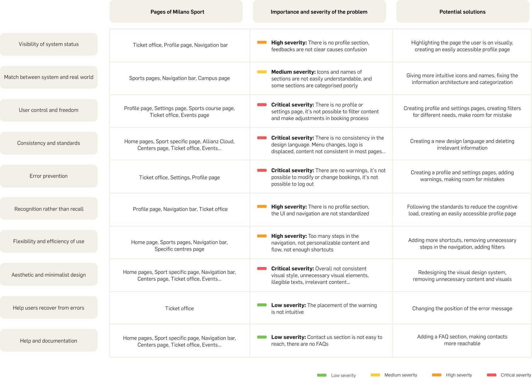
We looked at each page, and evaluated them based on Jakob Nielsen's Usability Heuristics to identify usability issues.
Benchmarking
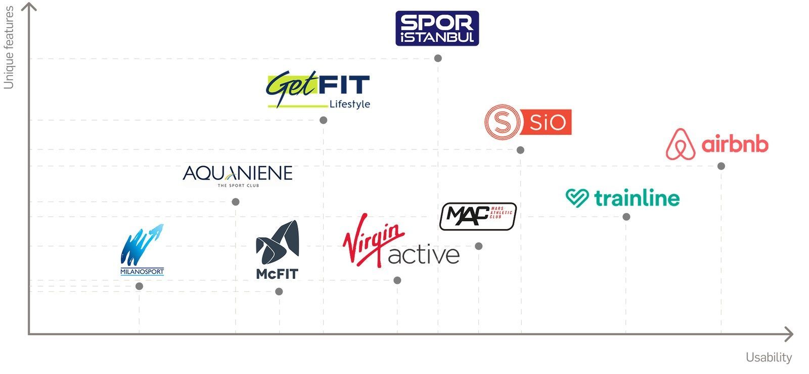
We tried to understand the main direct and indirect competitors of Milano Sport, and we analyzed the services where they're performing and in which areas it is lagging behind.
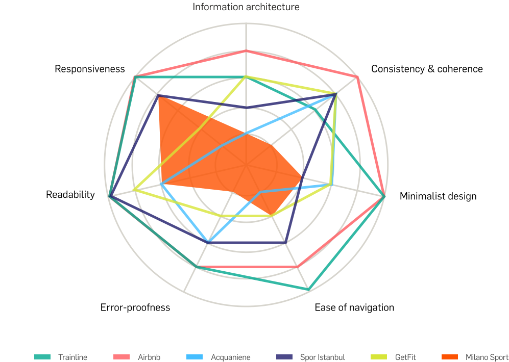
We found the following and identified the potential improvement areas for Milano Sport: consistency and coherence is the parameter that the competitors excel at and should be improved in Milano Sport. Airbnb and Trainline are very usable and straightforward, due to seamless navigation, clear calls to action, and minimalist design and easy-to-use and understand language. Milano Sport performs poorer in level of error-proofness, minimalism, readability, and ease of navigation, and can take inspiration from their simplicity, clarity, and modern design language.
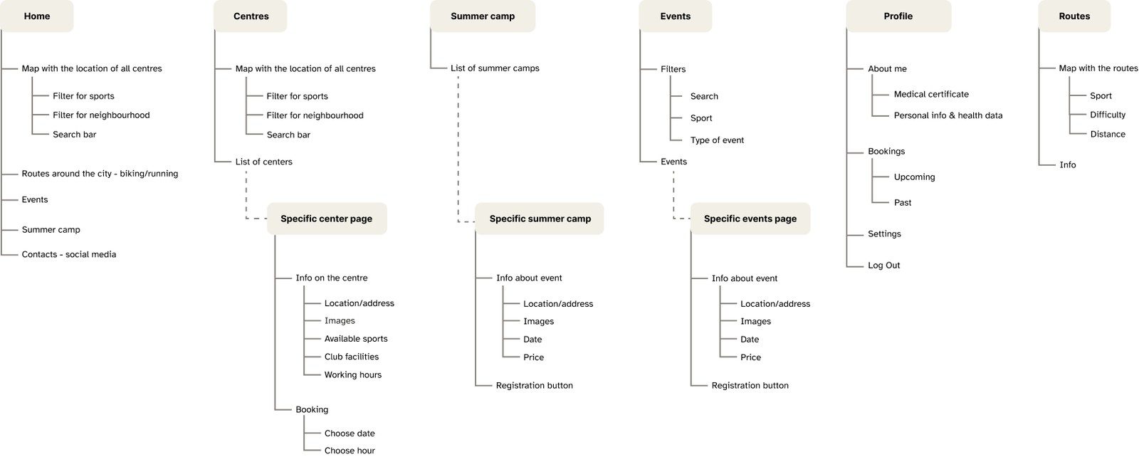
Information Architecture
We simplified the structure of the website and added new sections, such as profile and routes.
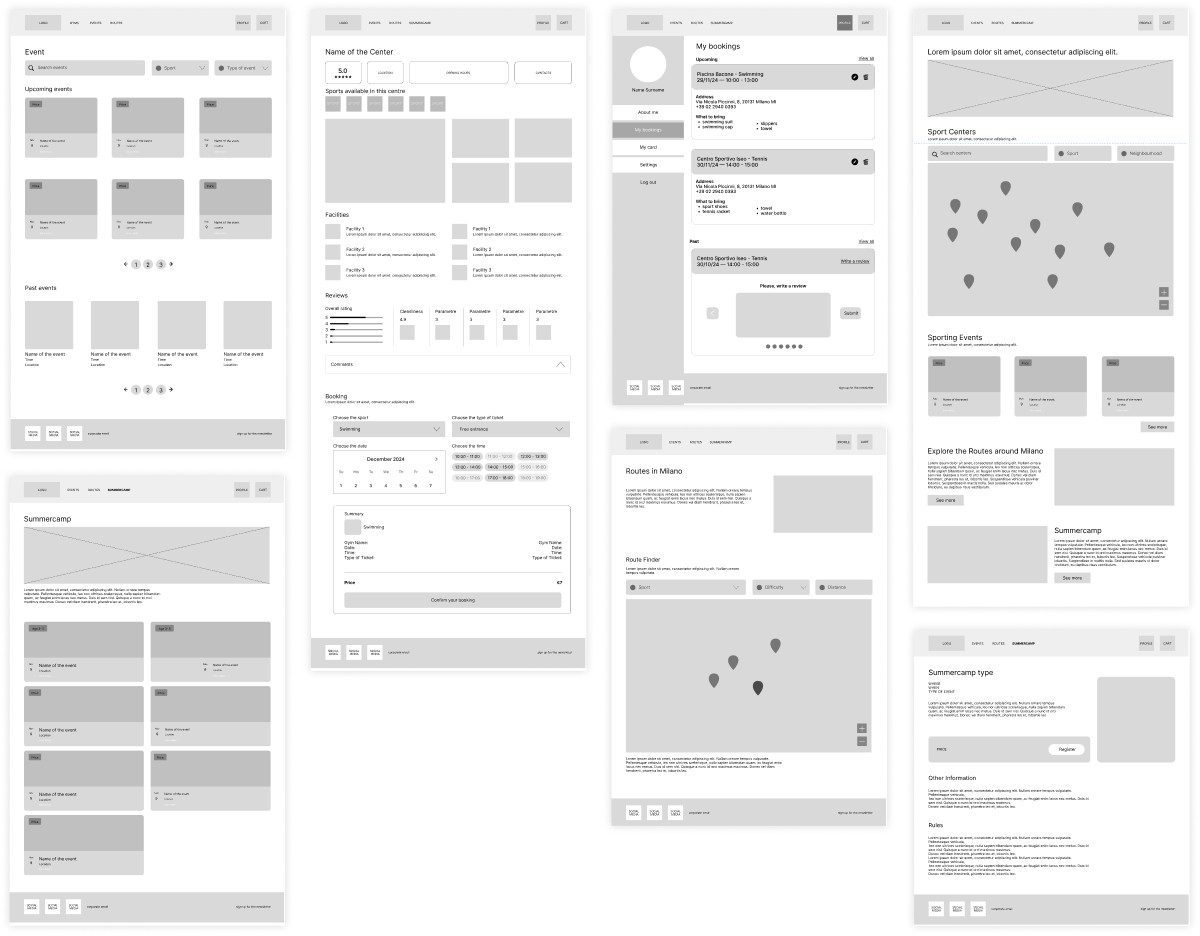
Wireframes
Since there were many usability issues in Milanosport, including but not limited to accessibility, consistency, and user control and freedom, we decided to design it from scratch. To do so, we created wireframes based on our information architecture.
Design System
Since there were many usability issues in Milanosport, including but not limited to accessibility, consistency, and user control and freedom, we decided to design it from scratch. To do so, we created wireframes based on our information architecture.
Logo
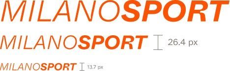
We designed a new logo in a more modern and minimal style that is more legible in small sizes.
Colors
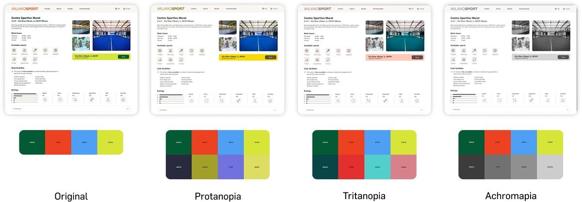
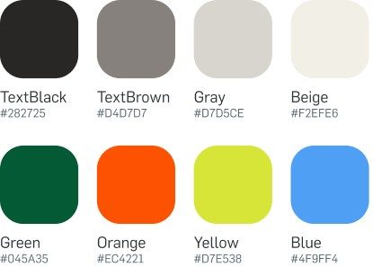
We used Stark app to evaluate and improve the contrast while considering different color blindness conditions.
Icons
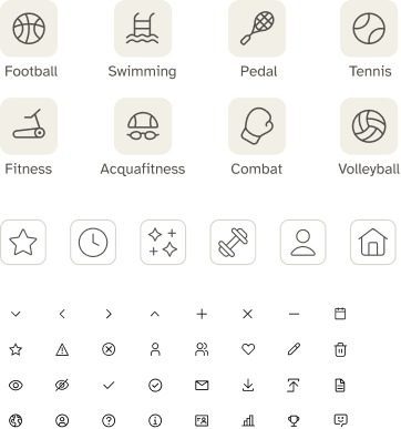
We recreated the icons for a unified visual language.
Typography
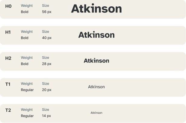
We chose this Atkinson Hyperlegible because in our personas we have users who have difficulties in reading, therefore we wanted to make the website accessible to everyone.
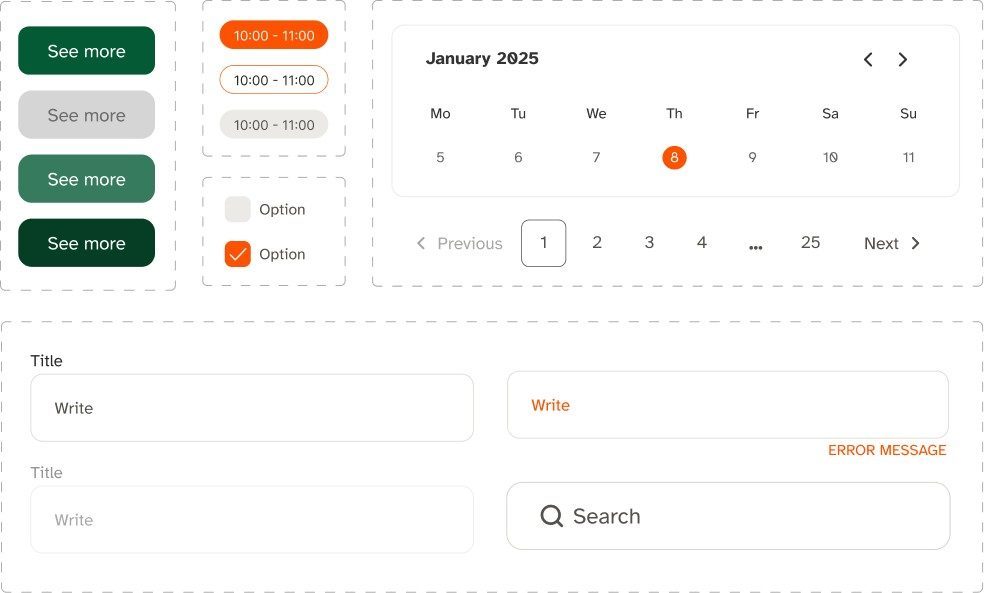
Buttons, selections & text inputs
We tried to visually give feedback to the user with different states.
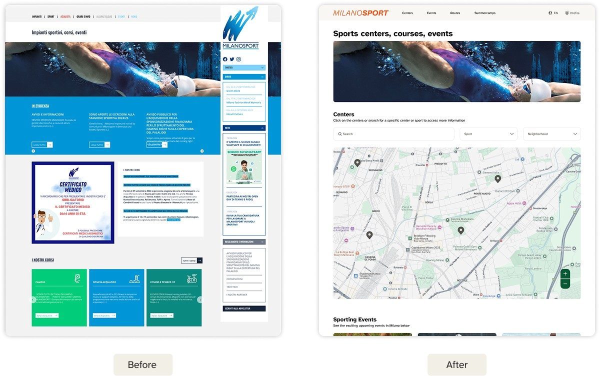
Redesign
Home Page — We simplified the overall look and the content for the home page. We organized the content in terms of hierarchy and made it more understandable and easy to use. We wanted to highlight the icons and their locations, that's why we added an interactive map, where the users can see important information easily.
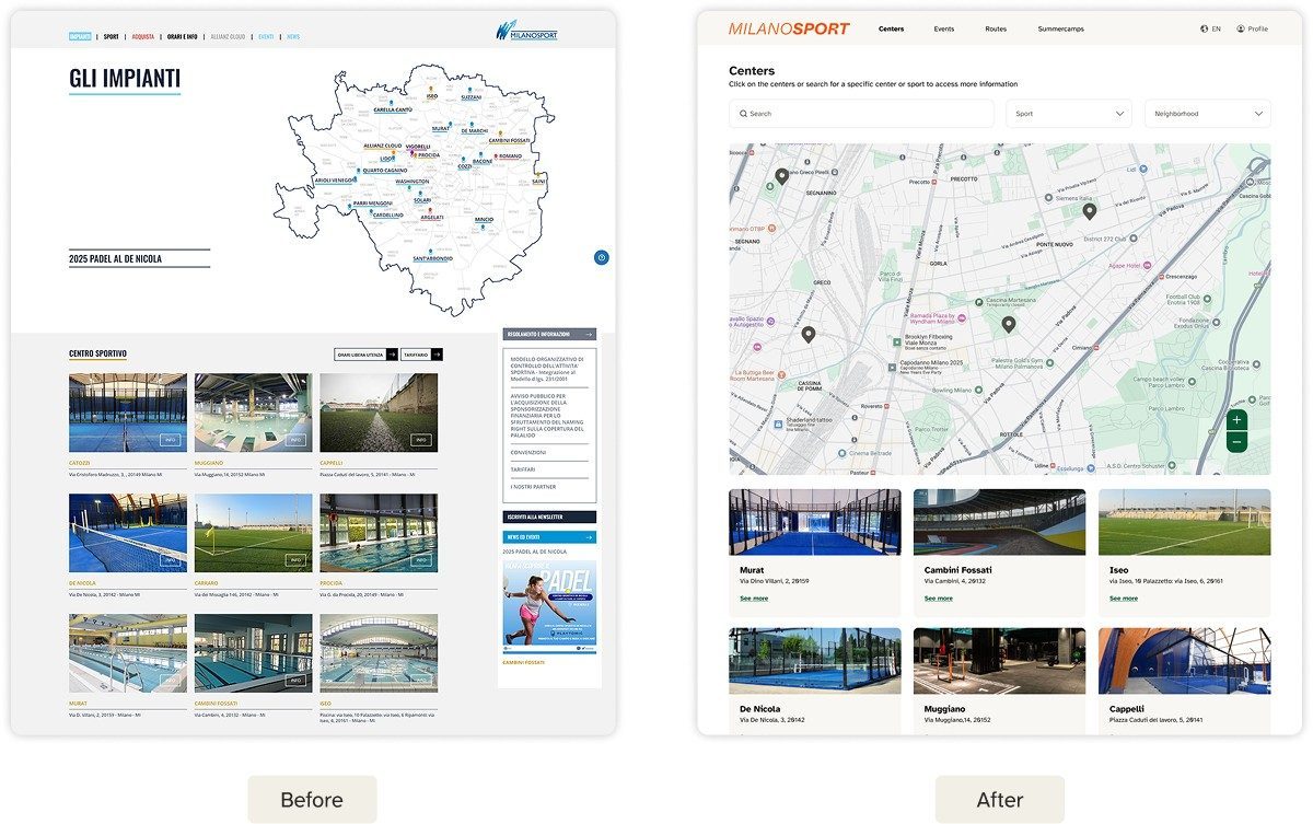
Centers Page — It was hard to find the centers page before. That is why we made it a part of the navigation bar for ease of user access. We added filters and an interactive map to help users find the relevant center more efficiently.
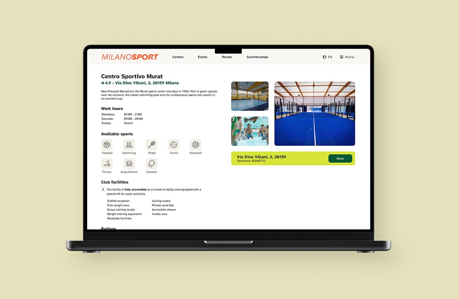
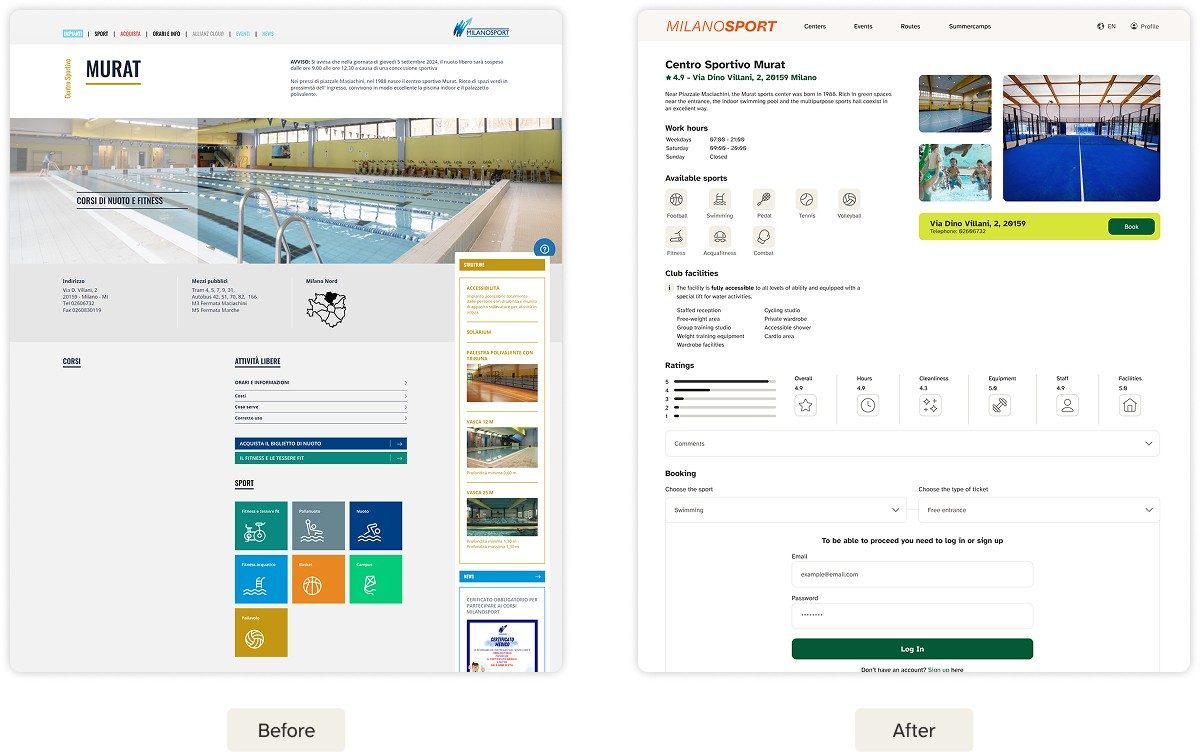
Specific Center Page — We highlighted the booking call to action and other important information (availability, hours, sports, facilities) to be at the front, making them easier to reach, and we embedded the location of the center on the same page.
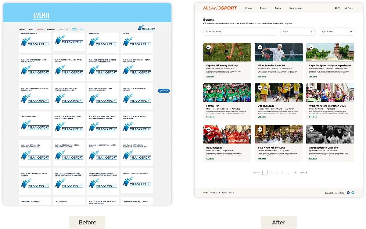
Events Page — We simplified the overall content, removing events that weren't relevant to the user, and added filters so it's easy and quick for the user to sort and find the events they're interested in.
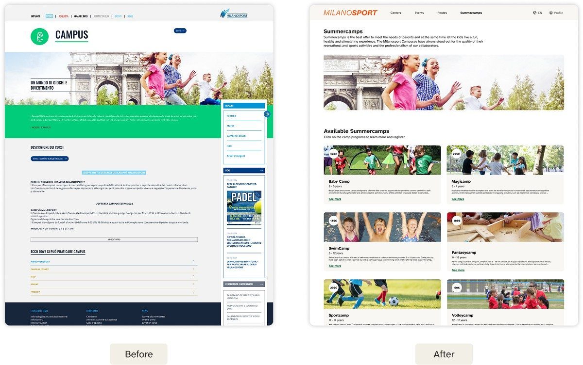
Summercamps Page — The page's original name didn't reflect what it was about. The information presented on the page was not organized in a clear and consistent way, so we renamed and reorganized it to make the available options easier to navigate.
Summary
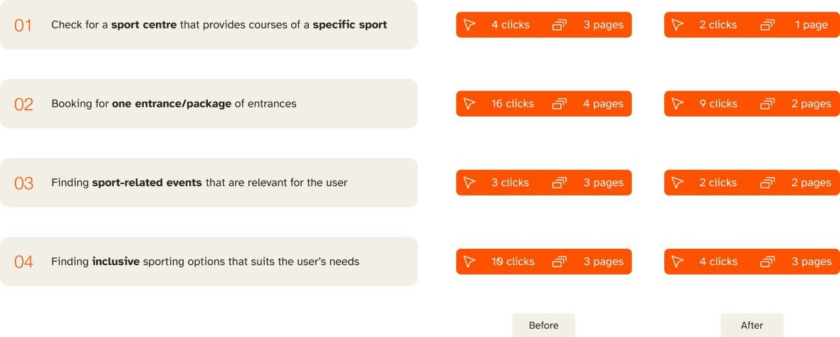
For each task we significantly reduced the number of clicks and pages needed, simplifying the navigation flow.
Accessibility
We tested and simulated our prototype considering different types of color blindness conditions using the Stark app.